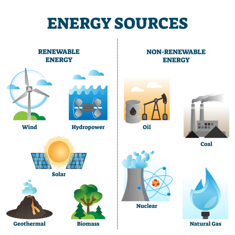
Now that you have a better understanding of the differences between primary and secondary energy, and have completed your own analysis of global primary energy consumption numbers, let’s move on to another topic: What is the difference between renewable and non-renewable energy? When energy sources are consumed they must be replenished over time in order to satisfy the production and consumption we require. However, a stark difference between non-renewable and renewable energy sources is the amount of time it takes for replenishment. Non-renewable energy sources such as crude oil, natural gas, and coal take a very long time to form, much longer than the average human lifespan. It takes millions of years to replenish these energy resources, and we often recount their age of origin with the geologic time scale. However, renewable energy sources such as solar, wind, and geothermal are replenished in nature over much shorter periods of time. In addition to renewable resources producing fewer emissions than are produced from fossil fuels to generate power, we can consume renewable energy without fear our supply will be constrained in comparison to fossil fuels.
Now that we have some understanding of the difference between renewable and non-renewable energy, let’s explore global renewable energy generation. Using the interactive chart below that plots renewable energy generation measured in terawatt-hours answer the following question. By clicking the “relative” box in the upper left hand corner of the chart you can look at global renewable energy generation shown in percentages.
What is the dominant global “modern” renewable in 2020? What are the 2020 percentages for the 4 types on the chart (hydro, wind, solar, other)?
Note that other renewables on this chart include geothermal, biomass, waste, wave and tidal (traditional biomass is not included).
Correct.
Incorrect.
Incorrect.
Next we will analyze an interactive chart for installed wind energy capacity. Follow the instructions below and answer the corresponding question.
Interactive chart instructions:
A. The “Chart” tab should be selected at the bottom of the graph (by default)
B. Next, change the choice of countries to include only the following 6 countries by clicking on “+ Add Country.” You may wish to click ‘Unselect all’ in the upper right for a refreshed unselected list, and then click on the following countries from the list. Once you have closed the country-selection window, you should see a new bar graph.
- China
- France
- Germany
- India
- Spain
- United States
- France
Of the six countries you selected, what country has had the most dramatic recent growth in installed wind energy capacity over the last ten years?
Note: To change the x-axis scale on your plot to 2010-2020, click anywhere on the time slider beneath the graph – this will give you a line plot and you can adjust the nodes on the slider for the interval of interest (2010-2020). To return to the bar graph, slide one node on top of the other so that the two overlap (a single year).
Incorrect.
Incorrect.
Correct.
No country compares to China in regard to total installed wind energy capacity and its growth over the last decade.
Next, let’s look at installed solar capacity for eight pre-selected countries and answer some questions. Be sure to follow the instructions below before answering the corresponding questions.
Interactive chart instructions:
A. The “Chart” tab should be selected at the bottom of the graph (by default).
B. Once you have reviewed the chart, click the “play” button to watch the history of solar growth over the last 20+ years.
What country has had the most dramatic growth in installed solar capacity within the last decade?
Incorrect.
Incorrect.
Correct.
No other country on this chart compares to China with respect to growth in installed solar capacity.
With the blue slide bar on the bottom of the chart, pull one end to year 2000 and the other to 2014.
What country took an early lead in installing solar energy capacity?
Incorrect.
Correct.
Although Germany has installed many solar panels, efficiency may be low because of the lack of sunshine.
Incorrect.
With the blue slide bar on the bottom of the chart, pull one end to year 2000 and the other to 2020.